28 Apr

Using IBInspectable and categories to set a UIView’s layer properties from IB.

Using IBInspectable and categories to set a UIView’s layer properties from IB.


This tutorial is based on a github project called IBInspectable_Objective-C. (link)

Xcode 6 adds the new attributes IBInspectable which lets you mark properties of your custom UIView objects so that they are exposed in (IB) Interface Builder. You can then see and edit the property right from the IB Attributes inspector.

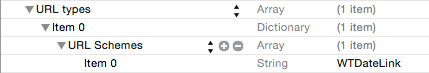
The “Attributes inspector” for the custom properties this project adds look like this:

IBInspectable IB Attributes inpsector

Simply adding the UIView+LayerProperties.h and UIView+LayerProperties.m files to your project, these new properites appear in the IB Attributes inspector and changing them causes your view to draw with the specified border and background color settings.

Prior to the addition of IBInspectable, you had to use “User Defined Runtime Attributes” to set custom properties. This was a write-only option, and required that you know the correct keypath and data type to set the desired property, and if you got it wrong, your program crashed at runtime with a very cryptic message about a class not being compliant the KVC protocol for a property.

I often find myself wanting to add a border to views. I might want to make the border of a view’s layer a custom color, vary the line thickness, and/or add rounded corners. It is also sometimes usesful to alter the background color of a border’s layer (as distinct from the view’s background color.)

I’ve written a simple category on UIView that exposes all of these settings as properties of UIView. Here is the header file for the UIView category:

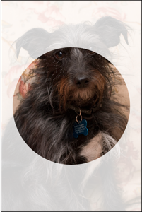
The result of creating a simple UIView with the settings above (light blue 1 point border with a 10 point corner radius) looks like this:

IBInspectable layer settings results

Unfortunately, as of this writing, the IB_DESIGNABLE attribute, which causes Xcode to render your custom views directly in IB, does not seem to work for categories.

The code for the category is below. It’s very simple.


26 Apr

Animating shapes using CAShapeLayer and CABasicAnimation

RandomBlobs

(You can download this project from Github at this link: RandomBlobs on Github)

A project that shows how to create random, non-selfintersecting smoothly curved shapes using UIBezierPaths and Catmull-Rom spline based smoothing. (With a tip of the hat to Erica Sadun, who’s path smoothing recipe is a key component.)

The shape animation from this project looks like this:

RandomBlobs

(click the image to open the GIF animation)


This project demonstrates a number of iOS aninimation and drawing techniques, as well as a few others.

Animation Techniques

  • Using Catmull-Rom splines to create a path out of a set of points, where all the points are on a curve.
  • Creating an animated shape using a CAShapeLayer and a CABasicAnimation that changes the layer’s path
  • Animating an object along a path (link: path animation)
    • Doing keyframe animation animation using the new iOS 7 UIView method animateKeyframesWithDuration:delay:options:animations:completion:
    • Duplicating the results of animateKeyframesWithDuration:delay:options:animations:completion: using Core Animation CAKeyframeAnimation and an array of points
    • Creating keyframe animations using a CAKeyframeAnimation and a CGPath

Miscellaneous techniques


24 Apr

Creating clickable URLs in a UITextField that open in your app

Creating clickable links that do something in your app.

The DatesInSwift app (which you can download from Git by clicking the link) includes a number of “magic dates” to demonstrate using tuples and a Swift switch statement for complex pattern matching.

The magic dates are listed on the screen, but I wanted a way for users to select them without having to enter them manually.

The app now displays an attributed string listing the magic dates, and those dates are links. If you double-tap or long-press on one of the dates, the app selects that date in the picker and chooses that date.

Here are the steps involved in making that work:

Teach the app to respond a custom URL scheme


I defined a new URL scheme, WTDateLink://. After setting up the DatesInSwift app correctly and installing it on a device, tapping a link that contains a WTDateLink URL in any app causes the system to offer to open the URL in DatesInSwift. Here’s what you do to make an app support a custom URL scheme:

Add a CFBundleURLTypes key to your app’s info.plist file. The value for that key is an array of the URL types your app supports. For the DatesInSwift app, we only add one entry, an dictionary with a key CFBundleURLSchemes that contains an array with a single entry, the string WTDateLink. The whole thing looks like this in XML format:


Sigh. Having formatting problems with that. Here’s what it looks like in the Xcode plist editor:

Custom URL scheme info.plist entry
The next step is to implement the application:openURL:sourceApplication:annotation: UIApplicationDelegate method. The system calls that method when the user triggers an event to open an URL of a type you’ve regestered for in your info.plist file.

In DatesForSwift, the URL format it supports is quite simple. A URL looks like this:

or

Which is a special case to pick the current date.

The application:openURL:sourceApplication:annotation: method looks like this:

Setting up a UITextView to support tapping on URL links:


The next step is to set up a UITextView so that it can contain links and respond to taps on those links.

  • Create a UITextView in IB (Interface Builder).
  • In the Attributes inspector, do the following:
    • Set the text type to Attributed
    • Make the text Selectable but not Editable
    • Under Detection, check “Links.”
  • Enter your text into the text field. If you want to style your text the easiest way to do it is ot edit the text in TextEdit then copy it and paste it into IB. Unfortuantely, the input box for styled text in IB does not honor links with a user-readable title and a URL that’s different than the text that’s displayed. The only type of links you can use here are URL strings like http://www.apple.com/store or `WTDateLink://?date=12_31_2000″. You can’t create a link that looks like this: The Apple Store. Getting clickable links where the text that’s shown is different from the URL requires special tricks.

Installing clickable links in your UITextView

There are 2 different ways to create a link where the title of the link is different from the URL:

  1. Construct an attributed string in code
  2. Load an attributed string from a file.

In OSX, the NSAttributedString method has an intializer initWithRTF:documentAttributes:. You can use it to load an attributed string directly from an RTF file. Unfortunately the iOS version of NSAttributedString does not support this initializer.

The good news is that NSAttributedString does conform to the NSCoding protocol, which makes it possible to convert an NSAttributedString back and forth to NSData.

The solution I’ve come up with is to write an OSX utility that attributed strings from RTF files using initWithRTF:documentAttributes:, then converts them to NSData and saves the data to a file with the suffix “.data”. I then load the contents of the file as an attributed string with code like this:

I have created an OSX command line tool that takes a path to an RTF file and an output path as parameters and creates the .data files for use in iOS. I then build that command-line tool into the build process of projects that need to load lots of attributed strings from files. The details of the command line tool are beyond the scope of this document. For this project, I just manually converted my RTF file to a .data file and included the .data file in the project.


23 Apr

IBInspectable demo


Using IBDesignable and IBInspectable


This Swift iOS project demonstrates some tricks with Interface Builder (IB) and class extensions to make your life easier.

You can download the project from Github at this link

IBInspectable demo project on Github

The project also demonstrates how to create an image view and a text label that are grouped together so they are centered on the screen together, and re-center if the text contents of the label get larger or smaller.

The project lets you enter text into an UITextField. The app changes the label on a grouped label and image view, and the laout of the view keeps everything positioned correctly.

See the section titled “Centering a group of views on the screen“, below.

Using IBDesignable and IBInspectable


Background:

in iOS, all UIView objects are backed by a Core Animation layer. Every UIView object has a property layer which is that object’s layer.

Some properties like borderWidth and borderColor are properties of the layer, not of the view.

Thus you can’t set a view’s border color or border width directly from IB.

You can sort of do this using “User Defined Runtime Attributes” settings in IB, and specifying a key of “layer.borderWidth”

You can’t do that with the view’s layer’s border color, however, because the color properties on a CALayer object are of type CGColorRef, not UIColor.
The controls in IB for IB specify colors as UIColors, not CGColors.

This project solves all these problems.

It includes a simple file UIViewExtensions.swift. That file adds a couple of computed properties to all UIView objects: borderWidth and borderColor. Futher, it makes these properties directly settable in IB by adding the @IBInspectable qualifier.

The class extension looks like this:

If you specify a borderwidth for a UIView, it sets the corresponding property on the view’s layer.
There is also a getter that lets you read your view’s layer’s borderWidth property

Likewize if you set/get a view’s borderColor property it sets/gets the border color of the view’s layer. In this case however it has to translate between the UIColor data type that IB uses and the CGColorRef type that is used for the border color of CALayer objects.

The @IBDesignable and @IBInspectable qualifiers do some cool Interface Builder magic.

Adding @IBDesignable to a property of a UIView object causes IB to display a control for getting/setting that property of the view. IB only supports a small number of data types, so you have to make sure you use one of those types.

If you look at this app’s view controller in IB, you’ll see that the image view and label near the center of the view have a light gray box around them. That’s the result of using the @IBDesignable setting.

The @IBInspectable qualifier does more magic. It causes IB to invoke your view class’s code to draw the view right in the IB view. In the case of the borderWith and borderColor properties, we can set these properties on a view and they show up in IB. (Behind the scenes, IB simply generates “User Defined Runtime Atributes” for these settings, but you don’t have to worry about entering a keypath or figuring out what data type to use, and IB shows you the name of hte property.)

Centering a group of views on the screen


This app shows how to create a group of views that include a text label, and keeps the group of views centered on the screen even if you change the text in the label.

The secret to this is to use a UIView as a container to hold the views that you want to position together. You then have to set up contstraints to get everything to size and position correctly.

In this app we have an image view and a label positioned together in a UIView which I will call the ContainerView.

Constraints for the ContainerView

The ContainerView is positioned in it’s superview (the view controller’s content view) based on it’s center. It’s centered horizontally, and offset from the center of the superview vertically.

Constraints for the image view

  • The image view and label have a constraint that sets them to use the same vertical center.
  • The image view’s leading edge is pinned to the ContainerView.
  • It’s centered vertically in the ContainerView.
  • It has a fixed height and width.
  • It’s bottom edge is pinned to the ContainerView.
  • It’s trailing edge is pinned 5 points from the leading edge of the lable view.

Constraints for the label view

  • The label view’s leading edge is pinned to 5 points from the trailing edge of the image view.
  • It’s trailing edge is pinned to 5 points from the ContainerView
  • It’s centered to the center of the image view. Since the image view is centered in the ContainerView. so is the label.

So here’s how it all works:

The ContainerView is centered relative to the center of it’s superview. The ContainerView does not have a size of it’s own, so it takes the size of it’s subviews.

The ContainerView’s subviews are all pinned to the edges of the containerView. The image view has a fixed size, but the UILabel does not. If you change the text of the UILabel, it resizes to fit the new text.

When that happens it triggers the ContainerView to update it’s layout. The ContainerView grows or shrinks as needed to fit the image view, label, and spacing specified in the constraints. The ContainerView’s constraints in it’s superview keep it centered as it grows and shrinks due to the label growing and shrinking.

The app screen looks like this:

IBInspectable Demo screenshot

23 Apr

Swift dates, switches and tuples

DatesInSwift


This app demonstrates a number of iOS techniques in Swift.

You can download the project from Github by clicking this link: DatesInSwift

It uses a date picker to let the user select a date. When the user taps the OK button, it displays a variety of messages depending on the date selected.

Extensions to NSDate


The program includes a file DateExtensions.swift that provides a number of useful utlities for working with dates.

Normally you can’t comare dates using ==, <, <=, >, or >=. The DateExtensions.swift extends NSDate to conform to the Equatable protocol, which allows the == comparison, and the Comparable protocol, which allows <, <=, >, or >= comparisions.

DateExtensions.swift defines a type alias mdyTuple which is a tuple containing the month, day, and year value for a date.

There are utilities that will convert NDate objects back and forth to mdyTuple tuples.

The NSDate instance method mdy() returns an mdyTuple.

The global function date(mdy: mdyTyple) takes an mdyTuple as input and returns an NSDate.

It turns out that you can’t match tuple constants in the cases of a switch statement by default.
In order to do that you have to implement the ~= (pattern match) operator for the tuple type.

For the mdyTuple type, the pattern match function looks like this:

Exploring Swift switch statements


Swift has a very powerful version of the switch statement. You can match strings, you can match ranges of values, and you can match tuples.

The following a valid in Swift:

or

But some of the real power of the Swift Switch statment comes in when you use tuples:

The DatesInSwift demo converts the user-selected date to an mdyTuple, then uses it to demonstrate various types of switch cases.

First, define some constants:

Then do some setup:

And finally the switch statement:


22 Apr

Core Image Filter demo

CoreImage Filter Demo

This project lets you explore the CoreImage filters offered by the current version of iOS.

You can download it from Github by clicking the following link: CIFilterTest

At launch it interrogates the system for a list of supported filters and adds them to a popup list of filters.

It attempts to set reasonable values for the different parameters, and looks for settings that specify slider settings. When it finds settings that specify slider settings it configures up to 6 sliders with the name of the attribute and its maximum, minimum, and default value.

It will also add UI controls to set input points, colors, rectangles, and points for pespective projections.

It has hard-coded settings for a few filters like the QR code generator and the 3×3 and 5×5 convolution filters that use special input types.

This project now uses a Cocoapod to add support for iOS color pickers.

NOTE: Be sure to open the Xcode workspace file, not the project.

Note the the project is for iPad only, and runs MUCH bettter on an actual device. (Apparently the simulator implementation of Core Image is quite slow.)

This project includes a method, listCIFiltersAndShowInputKeys:, which queries the CIFilter class and writes a formatted list of available filters to the debug console. If you pass in YES for the listFilterKeys parameter then it also logs information about the input parameters for each filter. Click this link to see the output from this function from iOS 7.1.

Click this link for an explanation on using Core Image filters.

Click This link for a overview of the program

Click here to read an article on shifting a view controller’s content view up to make room for the keyboard.

Click here for an article on creating debugger-friendly classes


22 Apr

Swift Performance Benchmark


SwiftPerformanceBenchmark


This is a hybrid Swift/Objective-C project for Mac OS. You can download it by clicking the following link:  SwiftPerformanceBenchmark

It was written as a performance benchmark to compare Swift and OBjective-C in a memory and compute-intensive task.

It calculates large arrays of prime numbers in both languages and tracks the amount of time required for both.

For the Swift test, you can choose to use either an Array object or an Array

For the Objective-C test, you can choose between NSArrays or C arrays.

It demonstrates a number of different techniques:

  • Definining classes in both Swift and Objective-C using a common protocol so that they can be used interchangeably.
  • Using Mac OS Cocoa Bindings to attach a window’s UI elements directly to properties of an object.
  • Running time-consuming tasks in the background with GCD and reporting status back on the main thread.

It also uncovers a limitation with the current version of Swift (1.1?) It seems that you can’t use KVO or Cocoa bindings to observe properties of an object, or link them with Mac OS Cocoa Bindings unless you write extra code. Cocoa bindings work perfectly when you change the property values from Objective-C, but the KVO methods fail to fire when you change the property values from Swift code.

The fix for this is to write custom willSet/didSet methods for the properties being observed that manaully call the methods willChangeValueForKey and didChangeValueForKey.

An example is the property swift_totalCalculated, defined in ComputedRecord.swift.


22 Apr

Cropping images in Swift

CropImg


A sample application for cropping images, written in Swift. You can download the project from Github at this link: CropImg

The CropppableImageView class:

The main class is the CropppableImageView class, which is a subclass of UIView.

To use a CroppableImageView in your project, drag a UIView into your XIB/storyboard. Then use the “Idenity Inspector” to change the type to CroppableImageView.

If you need to be notified if there is a valid crop area defined, set up a delegate object that conforms to the CroppableImageViewDelegateProtocol. That protocol only has 1 method, haveValidCropRect(). The CroppableImageView will call your haveValidCropRect() method when the user selects/deselects a crop rectangle. You can use the haveValidCropRect() method to enable/disable a crop button, for example.

The CropppableImageView has a method croppedImage() that returns a new image containing the portion of the source image the user has selected, or nil if the selection rectangle isn’t valid.

The CornerpointView class:

The CropppableImageView class uses another class, CornerpointView, to draw the cornerpoints of the image view, and allow dragging of the cornerpoints. A CropppableImageView sets up 4 CornerpointView objects and adds them as subviews in it’s init method.

The initalizers for CornerpointView create pan gesture recognziers and connect them to the view so CornerpointView objects are automatically draggable.
The CornerpointViews centerPoint property is optional and is initially nil. The centerPoint property has a didSet method that hides the CornerpointView if the centerPoint is nil and un-hides the corner point if the centerPoint is not nil.

The CornerpointView class has an optional cornerpointDelegate property. (If you set a conerpointDelegate, it must conform to the CornerpointClientProtocol.) The CropppableImageView sets itself up as the delegate of it’s CornerpointViews.

The only method in the CornerpointClientProtocol is cornerHasChanged. It simply tells the delegate that the user has moved the corner point. It passes a pointer to itself so the delegate can tell which corner has changed.

The ViewController class:

The ViewController class coordinates between theCropppableImageView` and the button that triggers image cropping.

The ViewController class also offers a button to load a new image into the image view.

Loading a new image is handled by the handleSelectImgButton IBAction method. This method uses the new UIAlertController class, added in iOS 8 instead of the now-deprecated UIAlertView. (Note that if you want your app to run under iOS 7 and 8, you will still have to use a UIAlertView, or write code that uses a UIAlertView on iOS 7 and a UIAlertController under iOS 8)

A UIAlertController uses a modern block-based design pattern, where you create one or more UIAlertAction objects and attach them to the UIAlertController. These UIAlertAction objects are usually drawn as buttons, and inlcude a block of code that’s executed when the user chooses that option.

The “Take a New Picture” action and the “Select Picture from library” action both call the method pickImageFromSource. This method creates and displays a UIImagePickerController. The docs for UIImagePickerController say that you must use a popover to display the picker controller in a popover on iPad for anything but taking a picture with the camera. However, I’ve found that displaying a full-screen picker works on iPad, and it gives the user more room to navigate their photo library.

The crop button on the view controller’s view is linked to the handleCropButton() IBAction method. The handleCropButton() method calls the CropppableImageViews croppedImage() mehod to create a croppped image. It then plays a shutter sound, displays a white view on top of the image to simulate a flash of light, then finally calls the Cocoa Touch method UIImageWriteToSavedPhotosAlbum to save the cropped image to the user’s photo album.

There is code at the bottom of the handleCropButton() method that will save the cropped image to the user’s documents directory instead, in case that’s what you need to do in your app.


22 Apr

Swift Piecharts

PieChart

A sample iOS app written in swift that generates pie charts.

You can download the project from Github at this link: PieChart

This program demonstrates a number of techniques, both in using the Swift language and using UIKit and Core Animation.

https://github.com/DuncanMC/PieChart

The screen looks like this:

Screenshot

The app defines a structure Slice which describes a single slice of a pie chart:

Both the radius and width settings define default values, so you can create a slice object with

Or

If you don’t specify a radius, all the slices use the largest radius size.
If you don’t specify a width, all slices get the same width value, so each slice is has the same arc angle.

The class PieChartView, a subclass of UIView, does most of the work.

It has a property slices: [Slice] that is an array of Slice objects.

The slices property of the PieChartView has a didSet property obserer, so when you change the slices array, the view updates the pie chart to reflect the changes.

This is a cool trick with Swift. This simple property declaration

…defines the property obsever.

The property observer invokes the method updatePath() if you change the slices array or any of it’s elements.
The updatePath() method rebuilds the PieChart path and displays it.

The pie chart graph is drawn using a CAShapeLayer attached to the view.
The PieChartView creates a UIBezierPath that contains “pie wedge” shapes for each slice in the graph.

It then installs the CGPath from the UIBezierPath into the path property of the view’s UIShapeLayer.

If you change the values int the slices array without changing the number of elements, the PieChartView animates the changes to the graph by creating a CABasicAnimation that animate the change to the CAShapeLayer’s path property.

Animating a CAShapeLayer’s path property only works properly if the starting and ending path have the same number and type of control points.


22 Apr

ImageViewWithMask

A Swift Playground that shows how to create a custom subclass of UIImageView with a circular mask layer on top.

You can download the working project from GitHub at this link: ImageViewWithMask.

The results of the masking look like this:

cropped image